If you’re wrestling with digital representation of natural colors in your research or projects I’m open to discuss it. It’s a great reminder that precision in science goes beyond just measurements — it’s also about how we visually and digitally communicate what we observe in nature.
A couple of months ago, I’ve been deep-diving into the world of bean seed and flowers colors lately—specifically, common beans (Phaseolus vulgaris L.) and let me tell you, presenting their phenotypic color traits on a scientific web portal is way trickier than it sounds.
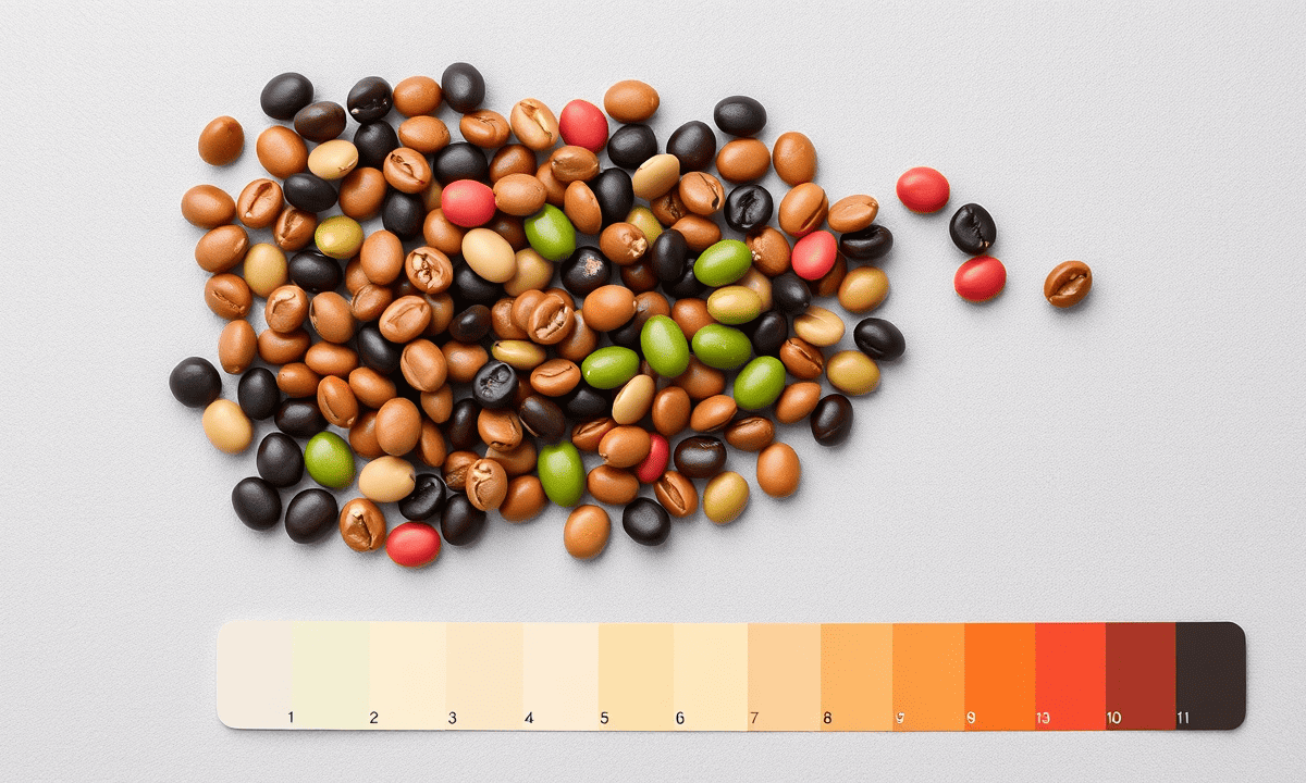
I found a study Seed Color Classification Method for Common Bean (Phaseolus vulgaris L.) using Imagery Data and an HTML Color Chart that laid out a method for classifying bean seed colors using imagery data anchored to the HTML color chart. At first glance, using HTML colors to represent seed colors online seems like a no-brainer—after all, just HTML, right? But here’s where things get complex.
Seed color isn’t just a simple hue — it’s a rich spectrum influenced by pigments like chlorophylls, carotenoids, and anthocyanins. The study categorized the seeds into seven groups: yellow-green, yellow, brown, red, white, gray, and indigo. But within those groups, shades vary with pigment concentration. For example, reds showed a high concentration distribution, meaning lots of subtle differences in reds depending on pigment levels. Meanwhile, gray and yellow-green were less dependent on concentration.
The challenge? Translating these nuanced natural color variations into the rigid, somewhat limited palette of HTML colors without losing accuracy. HTML color codes are great at providing consistent references but can sometimes lead to oversimplification or misinterpretations. If the website colors don’t faithfully represent the actual seed colors, researchers might misclassify or misunderstand the germplasm’s properties, which impacts breeding decisions, genetic management, or even marketing materials.
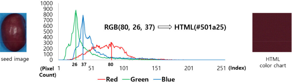
So, what’s the workaround? The study’s approach uses imagery data to pick precise HTML colors, effectively creating a color “map” for each seed based on its actual pigment data. It’s like plotting each seed color on an HTML color chart, anchoring real-life biology to a universally recognized digital color system. This creates a much clearer and more objective way to describe seed color that anyone accessing the web portal will understand without ambiguity.
I’m excited because this method doesn’t just help with beans; it could change how we digitally archive phenotype color data across many crops. Plus, having a consistent, accurate color classification supports systematic breeding and even product development — imagine marketing beans by exact color shades verified by pigment analysis!
In short, the struggle of data curation to avoid misinterpretation when displaying biological colors on the web can be tackled smartly by linking imagery data with robust digital color standards like HTML colors.
If you’re wrestling with digital representation of natural colors in your research or projects I’m open to discuss it. It’s a great reminder that precision in science goes beyond just measurements — it’s also about how we visually and digitally communicate what we observe in nature.